
The Ultimate Guide to Blue Food Packaging
Colour is one of the most powerful tools in product packaging, capable of influencing emotions, perceptions, and purchasing decisions in an instant. While reds and yellows shout for attention, the colour blue communicates a sense of calm, trust, and reliability. For food products, this can be a significant advantage. Using blue in your packaging can help build consumer confidence, convey freshness, and create a sophisticated brand image that stands out in a crowded marketplace.
This guide will explore the strategic use of blue food packaging. We’ll examine the psychology behind this popular colour, identify the types of food products it best complements, and discuss how customisation can amplify its benefits. For any UK-based business aiming to build a brand founded on trust and quality, understanding the nuances of blue packaging is a crucial step towards connecting with your target audience.
The Psychology of Blue in Branding and Packaging
The colour blue is overwhelmingly associated with trust, security, and dependability. It’s the colour of the sky and the sea, elements that are constant and universal. In branding, companies use blue to project an image of stability and professionalism—think of financial institutions, tech companies, and healthcare providers. When applied to food packaging, this same psychology is at play. Customers are more likely to trust a product that comes in blue packaging, subconsciously viewing it as safe, reliable, and of high quality.
Blue can also evoke feelings of coolness and freshness. This makes it an ideal choice for chilled or frozen food products. Light blue, in particular, suggests crispness and refreshment, which is why it’s commonly used for bottled water, dairy products, and frozen desserts. It sends a clear message to the consumer that the product inside is fresh and has been stored properly, which is a key consideration for many shoppers.
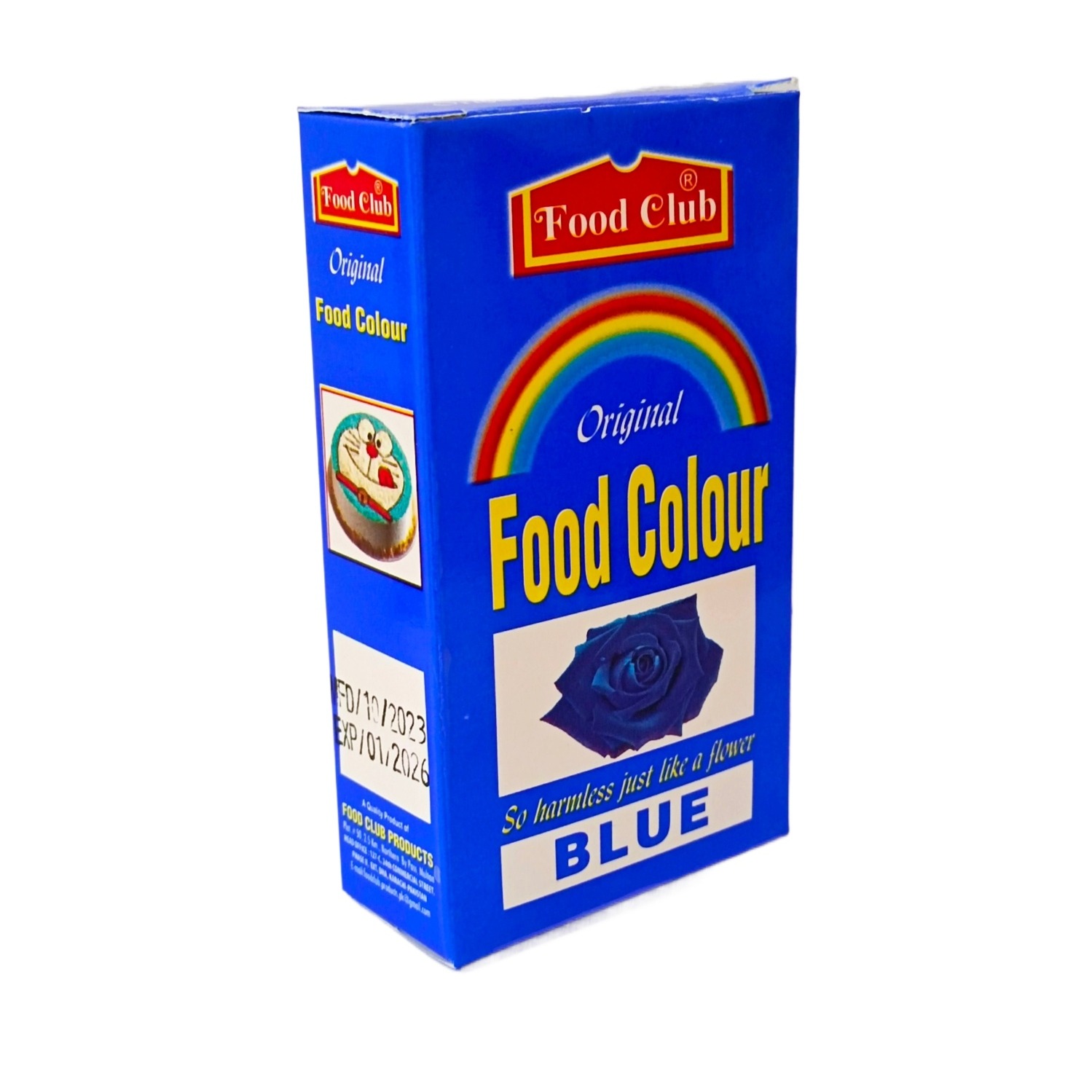
However, the shade of blue matters immensely. A dark, navy blue can convey elegance, authority, and luxury, making it suitable for premium or gourmet products. A bright, sky blue feels more playful and approachable, perfect for snacks or family-oriented products. Across the blue food packaging UK market, businesses are leveraging these different shades to communicate specific brand values and appeal to their target demographics.
Which Food Products Suit Blue Packaging?
Blue’s versatility makes it suitable for a wide range of food and drink items. Its ability to communicate trust and freshness makes it a natural fit for several product categories.
Dairy products are a prime example. Milk cartons, yogurt pots, and cheese packaging often feature blue to emphasize freshness and purity. The colour provides a clean backdrop that makes the white of the milk or yogurt appear even fresher and more appealing.
Seafood is another category where blue packaging excels. The association with water makes blue a logical and effective choice for fish and other seafood products. It reinforces the idea of fresh-from-the-ocean quality, helping to build consumer confidence in a product category where freshness is the top priority.
Snack foods, particularly savoury ones like crisps and crackers, frequently use blue. Here, the colour helps to differentiate them from spicier flavours often packaged in red or orange. Blue can signal a cooler, less intense flavour profile, such as salt and vinegar or cheese and onion.
Low-fat or “light” food options also often utilize blue. The colour’s calming, non-aggressive nature helps to position these products as a sensible, healthy choice. For health-conscious consumers in the UK, a product in a light blue food packaging can signal a healthier alternative.
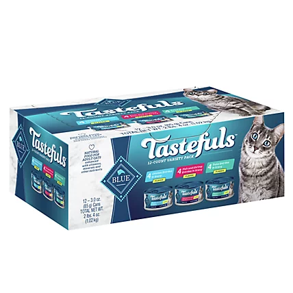
Blue Packaging in the Pet Food Sector
The pet food industry has also embraced the colour blue, using it to communicate specific product benefits to caring pet owners. As owners increasingly look for high-quality, specialised nutrition for their pets, packaging colour plays a vital role in conveying the nature of the product.
For instance, you might see cat blue food packaging used for formulas focused on seafood flavours, like tuna or salmon. The blue links the product to the ocean, suggesting fresh, high-quality ingredients that cats will love. It can also be used for specialised health formulas, such as those for urinary tract health or senior cats, where the colour’s association with trust and care is beneficial. It helps the product stand out and communicates a sense of gentle, effective nutrition.
Similarly, in the dog food aisle, blue is often used for fish-based formulas or products aimed at promoting calm behaviour. The colour helps to create a premium feel, assuring owners that they are choosing a product that is both nutritious and beneficial for their pet’s well-being.
The Competitive Edge of Customisation
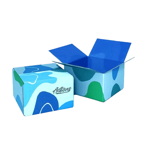
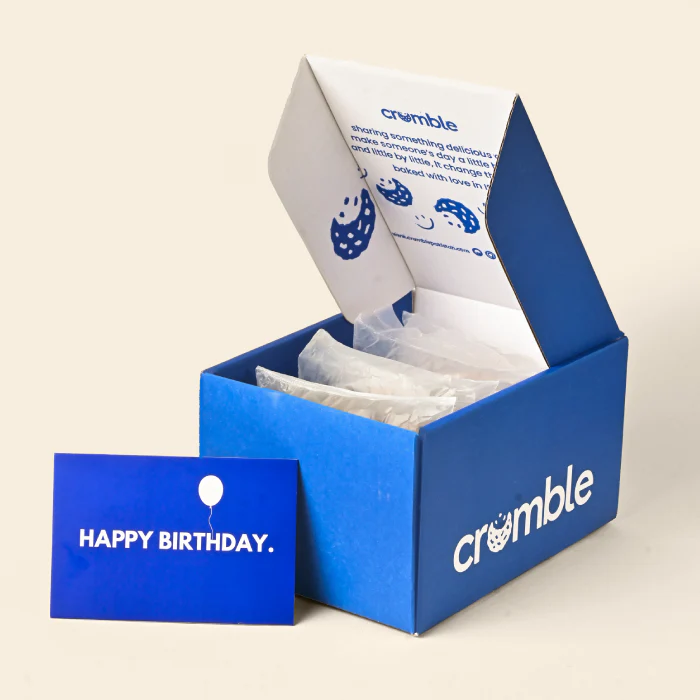
While standard blue packaging is effective, custom blue food packaging allows a brand to create a truly unique and memorable identity. Customisation moves beyond simply choosing a colour; it involves crafting a complete brand experience that resonates with customers from the moment they see the product on the shelf.
The opportunities for customisation are nearly endless. You can select a precise Pantone shade of blue that becomes synonymous with your brand. Combining this with high-quality printing for your logo, product information, and other design elements ensures a professional and cohesive look. Finishing touches like a matte or gloss varnish, metallic foil, or embossing can add a tactile element of luxury, making your product feel more premium. A silver logo on a navy blue box, for example, creates a classic and sophisticated look.
Customisation also extends to the physical design of blue food packaging boxes. You can create packaging with unique shapes, window cut-outs to showcase the product, or internal inserts to keep items secure. For delicate items like chocolates or baked goods, a bespoke box that provides a snug fit is essential for protection during transit. Partnering with a specialist supplier like wholesaleboxes.co.uk gives you access to design experts who can help you develop a packaging solution that is both beautiful and functional, ensuring a fantastic unboxing experience for your customers.
Frequently Asked Questions (FAQs)
Is blue an appetite suppressant?
While some studies suggest that blue can be an appetite suppressant because few foods are naturally blue, this effect is largely context-dependent. In packaging, blue’s association with freshness (water, dairy) and trust often outweighs this. It is a highly successful colour for many food categories, proving that its positive psychological associations are more powerful in a commercial setting.
What colours combine well with blue on packaging?
Blue pairs effectively with many other colours. White creates a clean, fresh, and classic look. Yellow or orange can provide a vibrant, energetic contrast that draws the eye. Silver and gold lend an air of sophistication and luxury, making them ideal for premium products. Green can be used with blue to emphasize natural or organic qualities.
Can I find eco-friendly blue packaging options?
Yes, absolutely. Most modern packaging suppliers offer a range of sustainable materials. You can get blue boxes made from recycled paperboard, FSC-certified card, or compostable materials. The inks used are also often soy-based or water-based, which are more environmentally friendly than traditional solvent-based inks.
How do I choose the right shade of blue for my brand?
Consider your brand’s personality and the message you want to send. A dark navy blue suggests authority, tradition, and luxury. A bright, electric blue feels modern and energetic. A soft, pastel blue communicates gentleness, calm, and nostalgia. Testing different shades with your target audience is a great way to see which one resonates best.
Does blue packaging work for warm food products?
Blue is most commonly associated with cool or cold products. For hot food-to-go, colours like red, orange, and yellow are often more effective as they suggest warmth and energy. However, a dark, sophisticated blue could work for a gourmet hot product if the branding is focused on luxury and quality rather than heat.